개발/대시보드
웹 대시보드 - 차트 그리기(scatter,regplot,hist,altair,map,plotly)
웅'jk
2022. 12. 13. 18:00
* import
import streamlit as st
import pandas as pd
import matplotlib.pyplot as plt
import seaborn as sb
* 데이터 가져오기
df = pd.read_csv('streamlit_data/iris.csv')1. Scatter 를 이용한 차트
# streamlit 은 plt.figure로 차트 영역을 지정한다.
fig = plt.figure()
plt.scatter(data = df , x = 'sepal_length',y='sepal_width')
plt.title('Sepal Length vs Width')
plt.xlabel('sepal length')
plt.ylabel('sepal width')
st.pyplot(fig)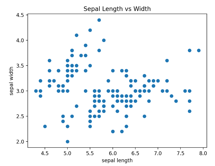
2. regplot
fig2 = plt.figure()
sb.regplot(data = df,x='sepal_length' , y ='sepal_width')
st.pyplot(fig2)
3.hist ( histogram)
fig3 = plt.figure()
plt.hist(data=df,x='sepal_length',bins = 10 ,rwidth=0.8)
st.pyplot(fig3)
4. 데이터프레임의 plot
fig5 = plt.figure()
df['species'].value_counts().plot(kind = 'bar')
st.pyplot(fig5)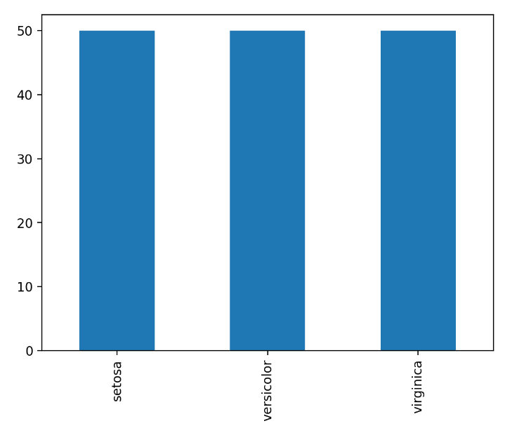
5. 데이터프레임의 hist
fig6 = plt.figure()
df['sepal_length'].hist(rwidth=0.8)
st.pyplot(fig6)
6. altair 의 mark_circle
import altair as alt

chart = alt.Chart(df2).mark_circle().encode(x='petal_length',y='petal_width',color = 'species')
st.altair_chart(chart)
7. map
# df3 에는 위도 경도 값이 있습니다.
df3 = pd.read_csv('streamlit_data/location.csv',index_col=0)
st.dataframe(df3.head(3))
st.map(df3,zoom=5)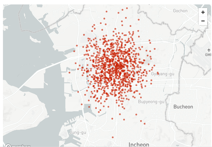
8.plotly 의 pie
import plotly.express as px

fig7=px.pie(df4,'lang','Sum',title='각 언어별 파이차트')
st.plotly_chart(fig7)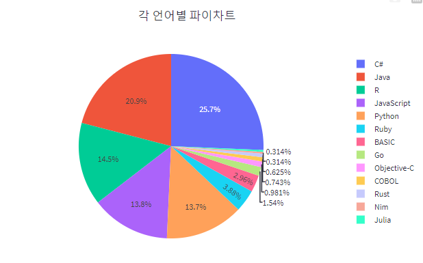
9.plotly 의 bar
 df_sorted = df4.sort_values('Sum',ascending=False)
 fig8 = px.bar(df_sorted,'lang','Sum',title='각 언어별 파이차트')
 st.plotly_chart(fig8)